Blackjack Brew Co.
Crafting a beer identity under the watch of the angels of the meadow
A firm favourite amongst the traditional scene in Manchester, Blackjack needed a brand that aligned with their strengths, sitting perfectly between the traditional world of CAMRA pubs, with floral pump clips and metal tankards, and the increasingly saturated world of progressive craft beer. The meeting points of this tradition and modernity is something we wanted to celebrate within the BJBC visual aesthetic.

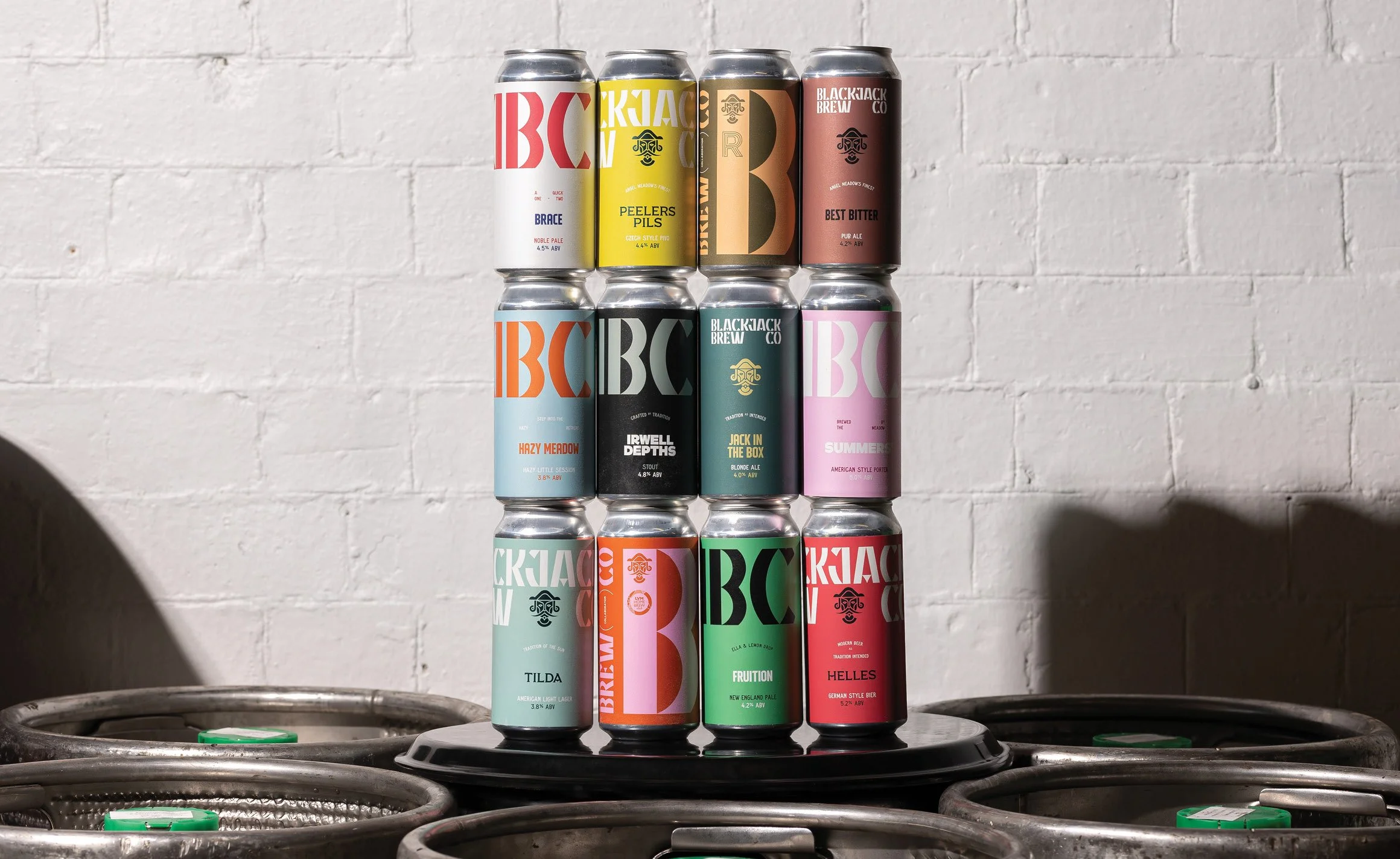
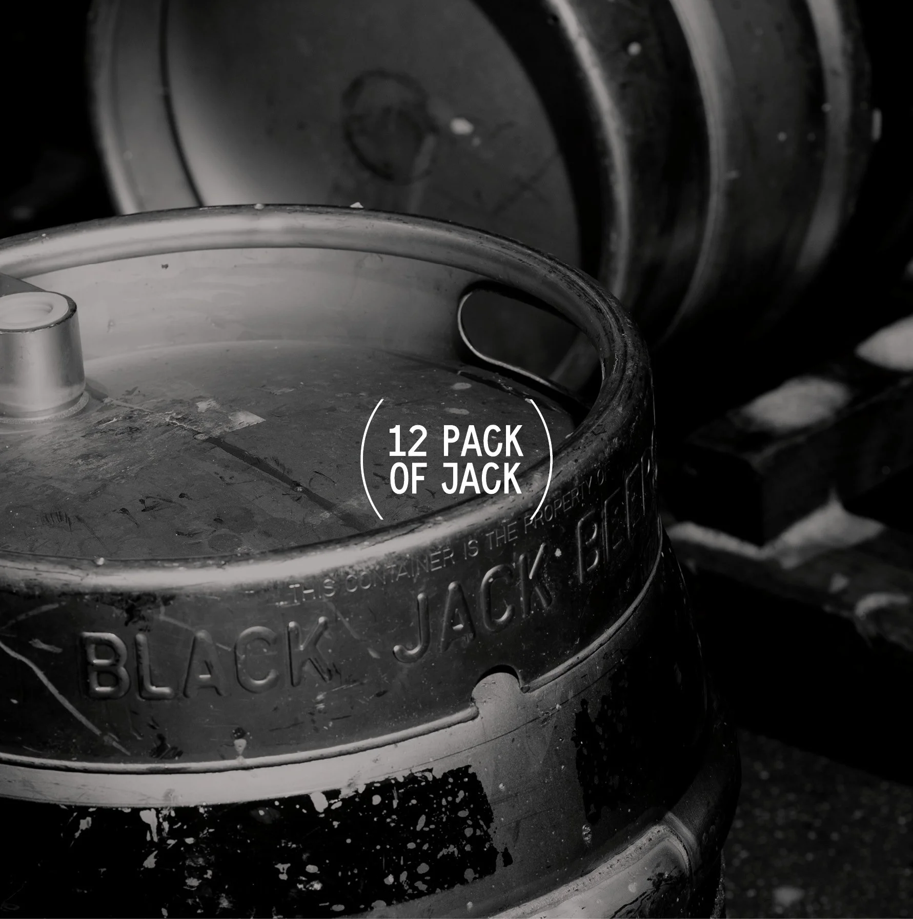
With over 42 beers produced annually, the final design solution needed to be built on a bulletproof system, allowing for the quick production of at least two new beers per month.
To enable this, we created a clean, concise design system that could create diversity across the ranges, whilst allowing us to easily create new can designs that would stay within the range, but allow enough flexibility for each can to be distinct in its own right.


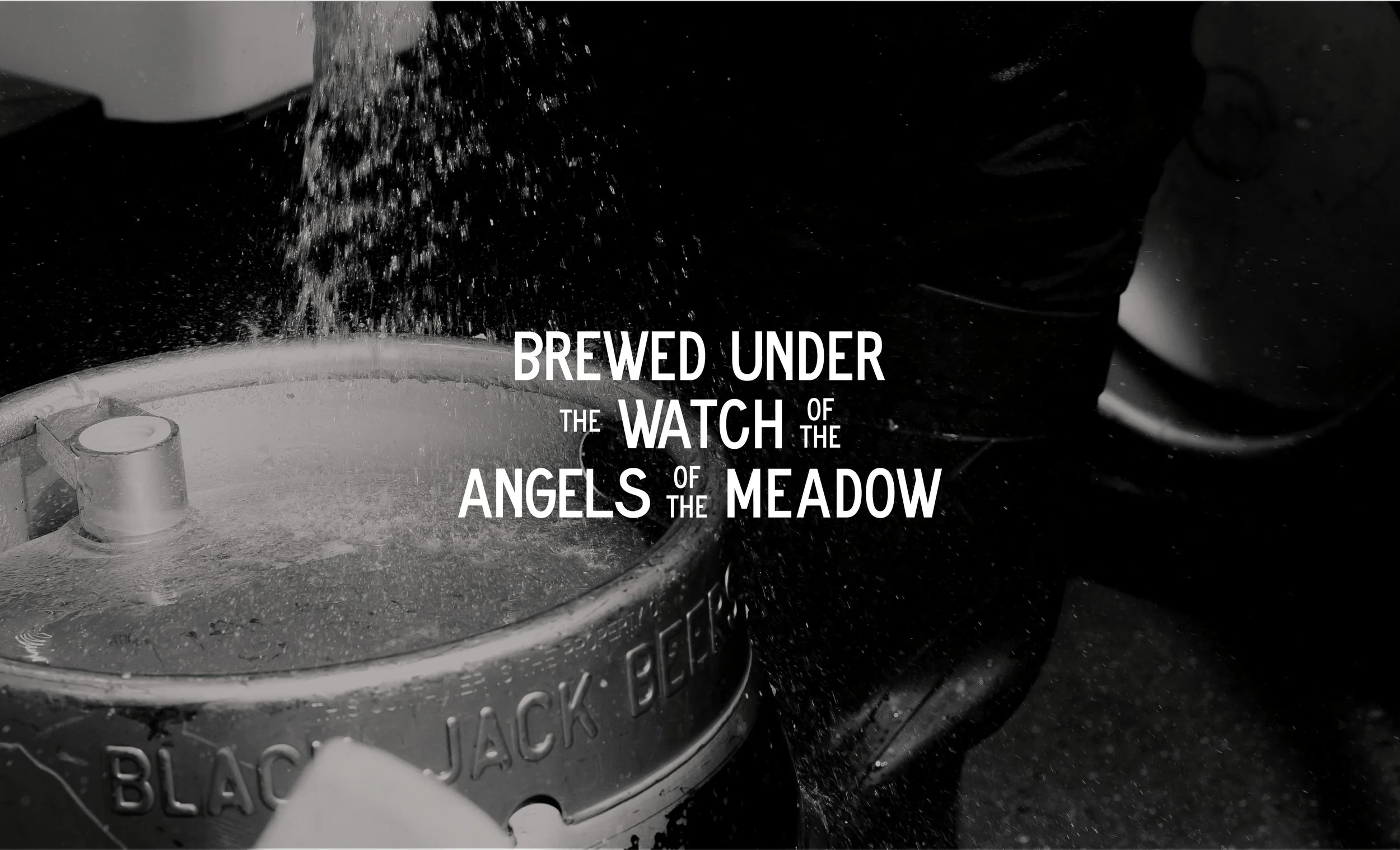


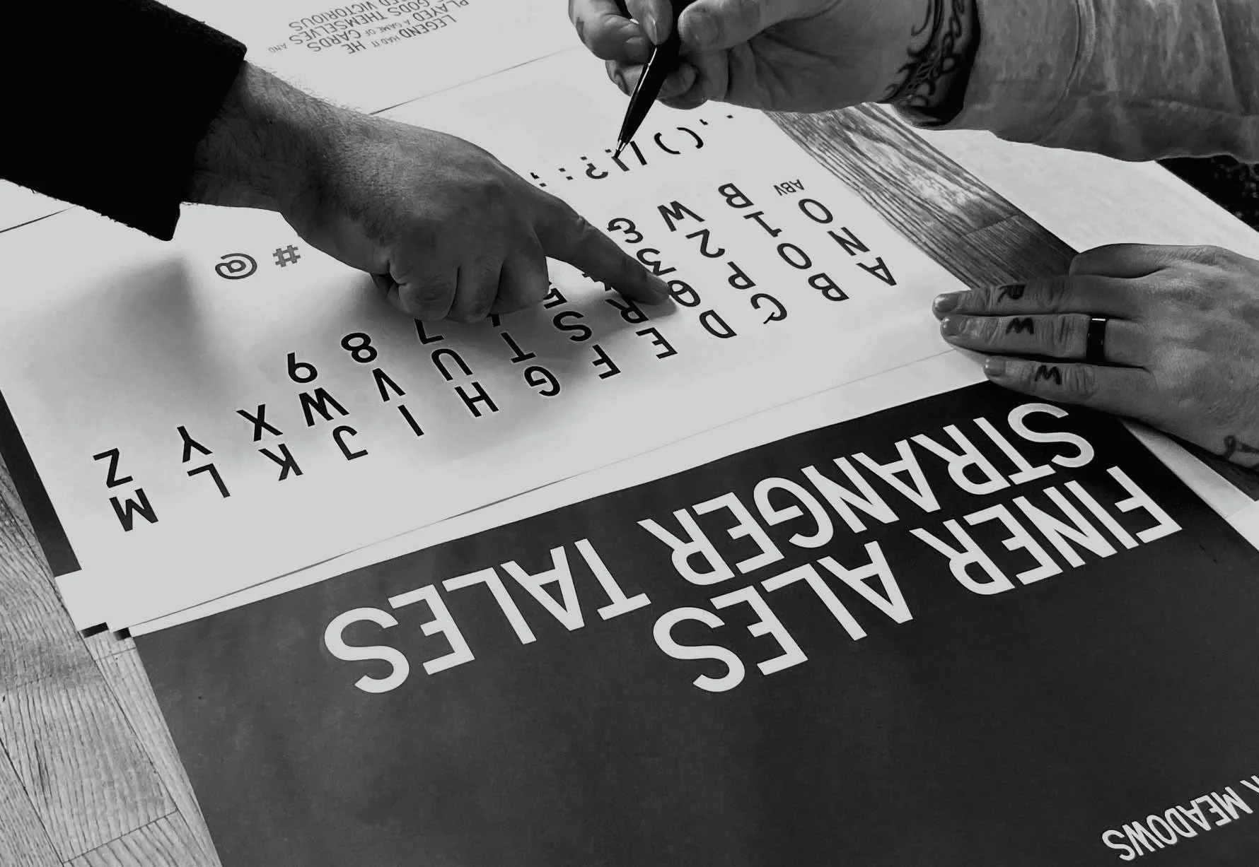


We began the creative process by documenting, recreating and regenerating found type of Blackjack's home – Angel Meadows .
Decorative headstones of the Meadow's burial field, the Victorian stonework of The Ragged School, street signs and hand-painted signage of their taproom were all drawn on as inspiration.
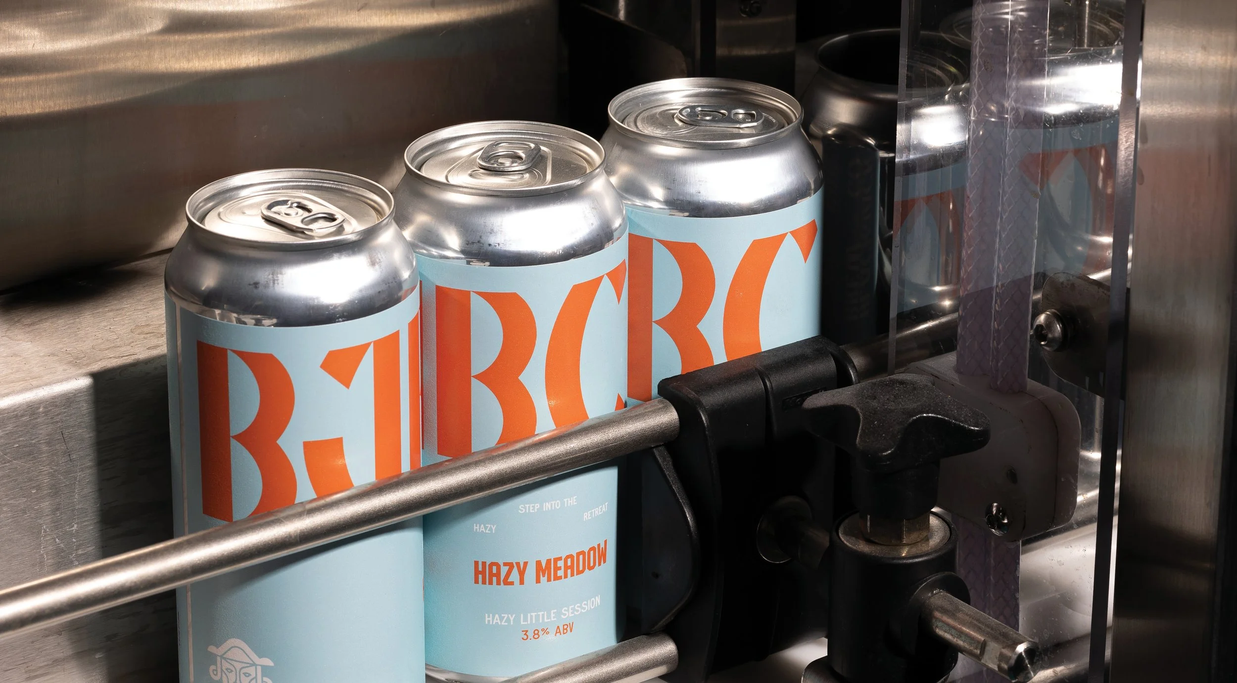
This gave life to a bespoke typeface – BlackJack Meadows, a condensed sans serif with all the quirks and nuance of the days of old, crafted to bring texture to the stories of the Jack and homage to the angels of the meadow.
Process


Further Case Studies