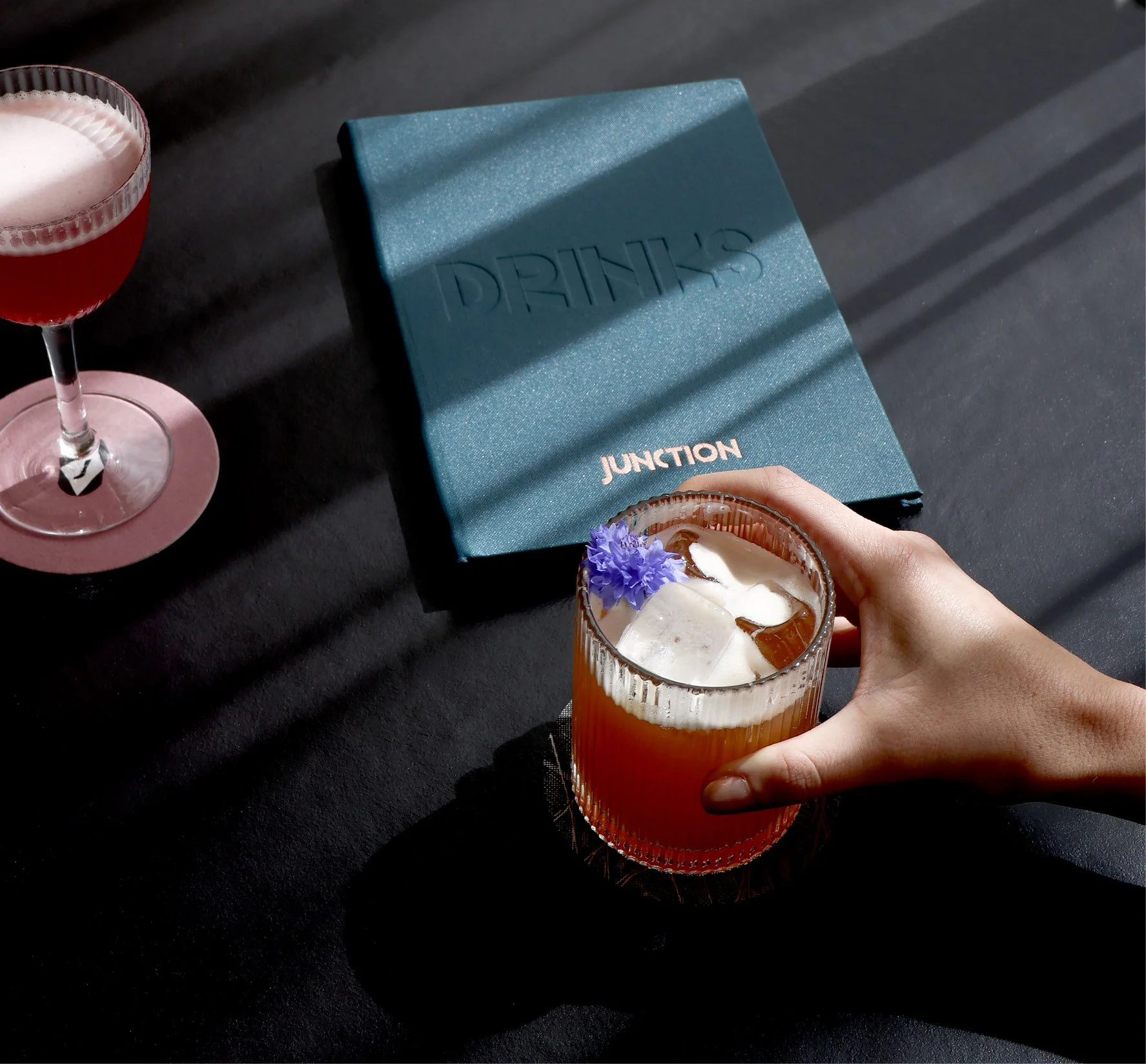
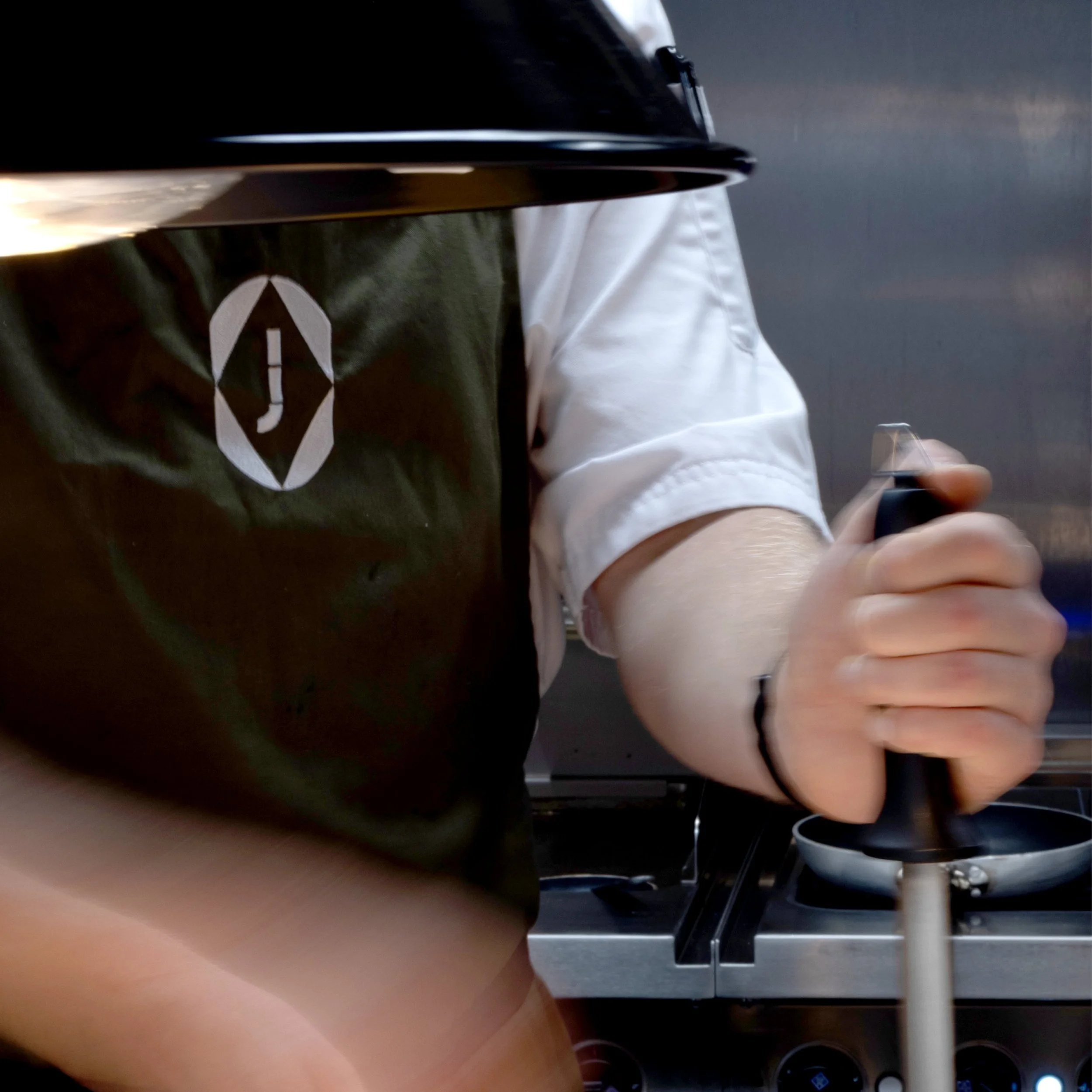
Manchester Central

Junction

Unearthing the heritage of a Manchester icon for a new food and drink concept

The site of Manchester Central has a unique provenance and legacy within the city: for over a century, it served as the city’s main railway station, and it now is home to one of the UK’s leading event spaces.

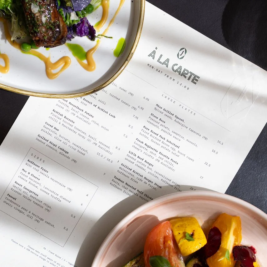
In a progressive step forward, Central set out to establish a new cafe, bar, restaurant and social workspace. With this, we were tasked with naming and branding this new concept.

We saw it as a missed opportunity not to draw on some of the building’s provenance and to carry this narrative forward – in its name, theme, or visual cues. This inspired a contemporary take on the rich rail history, defining a new chapter in the space's legacy without feeling overly themed or contrived.

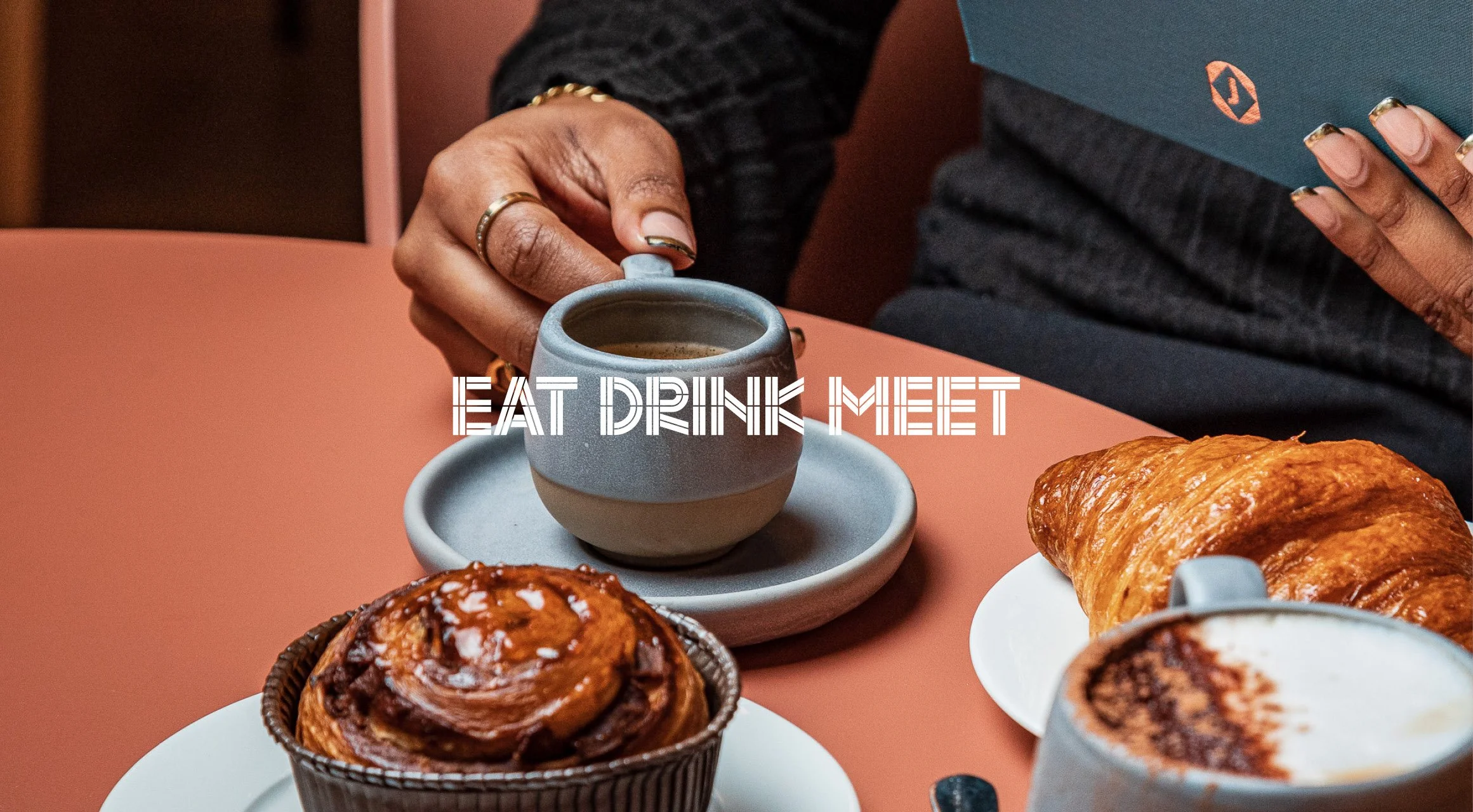
Introducing Junction – a flexible space open all day, every day, for everyone.

A pink cocktail drink in a coupe glass with a frothy top, set against a background of alternating pink and brown stripes. A stylised logo for 'Junction' overlaid, showing a white J.
Dark background with white text displaying 'Junction' with the words 'Eat Drink Meet' above and 'at Manchester Central' below.
A black card with words 'JUNCTION BLACK' in red and white lettering lying on a dark, textured surface, partially shadowed by a nearby object.
Interior of a modern coffee shop with large windows, plants, seating, and people.
A glass of orange-colored beverage with ice cubes and an orange slice on top, set on a pink surface against a pink background.
Sign with an capital J inside a white diamond shape on an orange background, hanging against a metallic, ribbed wall.
Modern lounge area with beige and pink chairs, round tables, large TV screen on wall, potted plants, pendant lights, large windows and exposed ceiling with ducts and lighting fixtures. The screen is showing an abstract red hued video of train footage
A hand holding a cocktail with ice and a purple flower, placed on a black surface next to a blue menu that reads "DRINKS" and "JUNCTION," with a pink coaster and glass of pinkish drink nearby.
A menu for 'Junction' on a table with a partially visible dish of colourful grilled vegetables in a pink bowl.
Person holding a cup of coffee, with croissants and cinnamon roll on plates on a pink table, overlay text says "Eat Drink Meet."
Breakfast table with toast topped with tomatoes and herbs, a burger with a fried egg and bun, a plate of sautéed mushrooms, a sunny side up egg with sausage on toast, a glass of orange juice, a latte, and a glass of water.
A black A-frame sidewalk sign with white and pink text advertising a food and drink establishment called 'Junction.' The sign promotes pastries, cocktails, brunch, and more, located at Manchester Central, with a small logo at the bottom.
Four restaurant staff members, three men and one woman, standing behind a counter in a kitchen, conversing with a female customer.
A cup labeled 'JUNCTION' being filled with dark coffee from an espresso machine.
Close-up of a person wearing a black vest and white shirt, holding a spatula near a stovetop, with a gray wall in the background.
Close-up of a pencil with decorative black and white pattern, a pink eraser with a black logo, and a black and white geometric design on the pencil. The background is black.
A dessert in a round, dark chocolate shell filled with creamy filling, topped with a honeycomb piece and small green leaves, served on a bed of crushed cookies in a light blue bowl.
A person in a beige jacket sitting at a table with a cup of coffee, a croissant on a white plate, a cinnamon roll, and a cup of cappuccino with foam.
Black and white photo of a train station showing an arched roof, a sign for the London and North Eastern Railway, and a large domed building in the background with a train platform and people walking in the rain.
Map showing routes from Manchester Central to Buxton and other nearby locations with station names.
Text graphic with the quote 'MENUS INSPIRED BY THE SEASONS' in white outlined font on a dark green background.
Restaurant menu titled 'À La Carte' with dishes listed and prices, placed on a table with a patterned cup in the background.

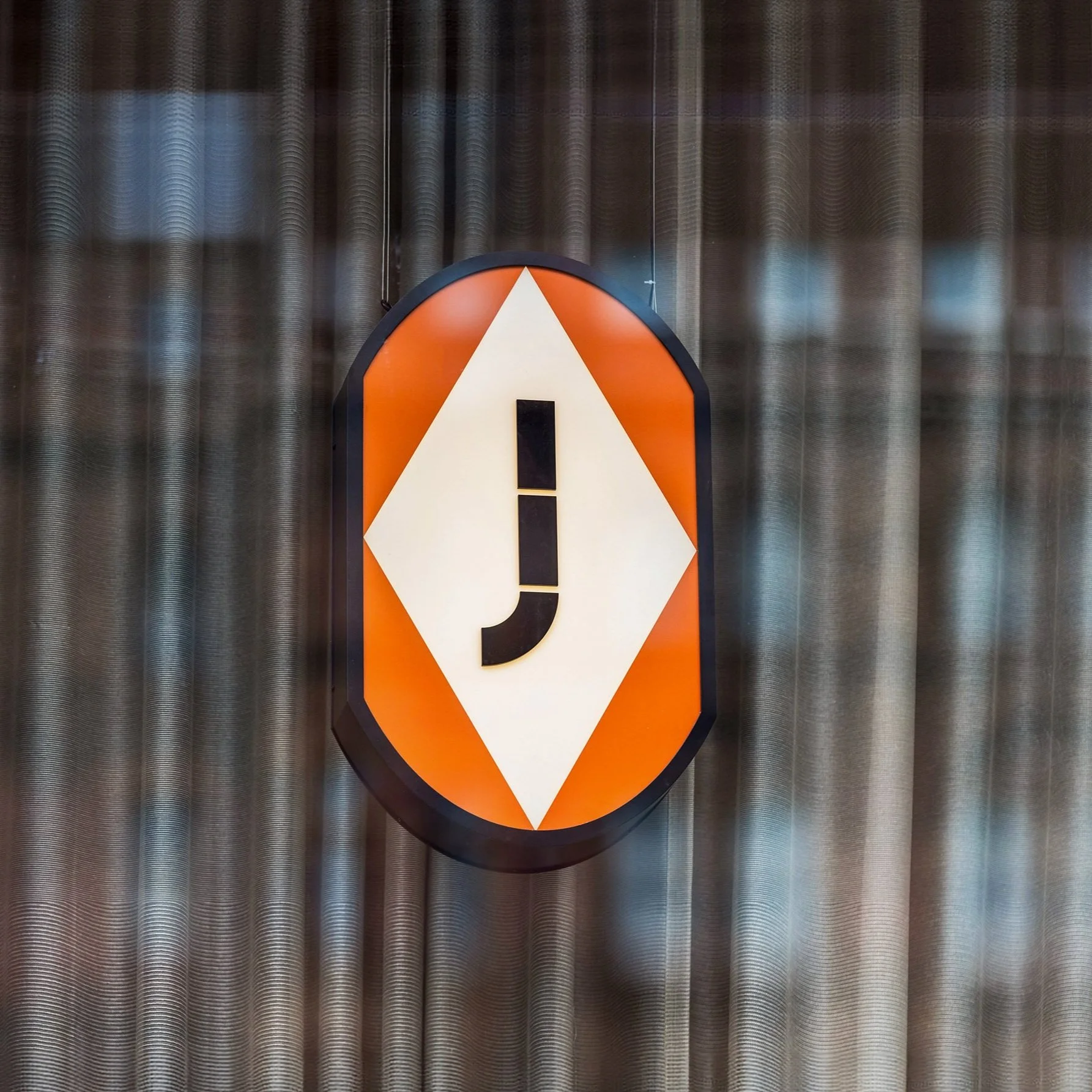
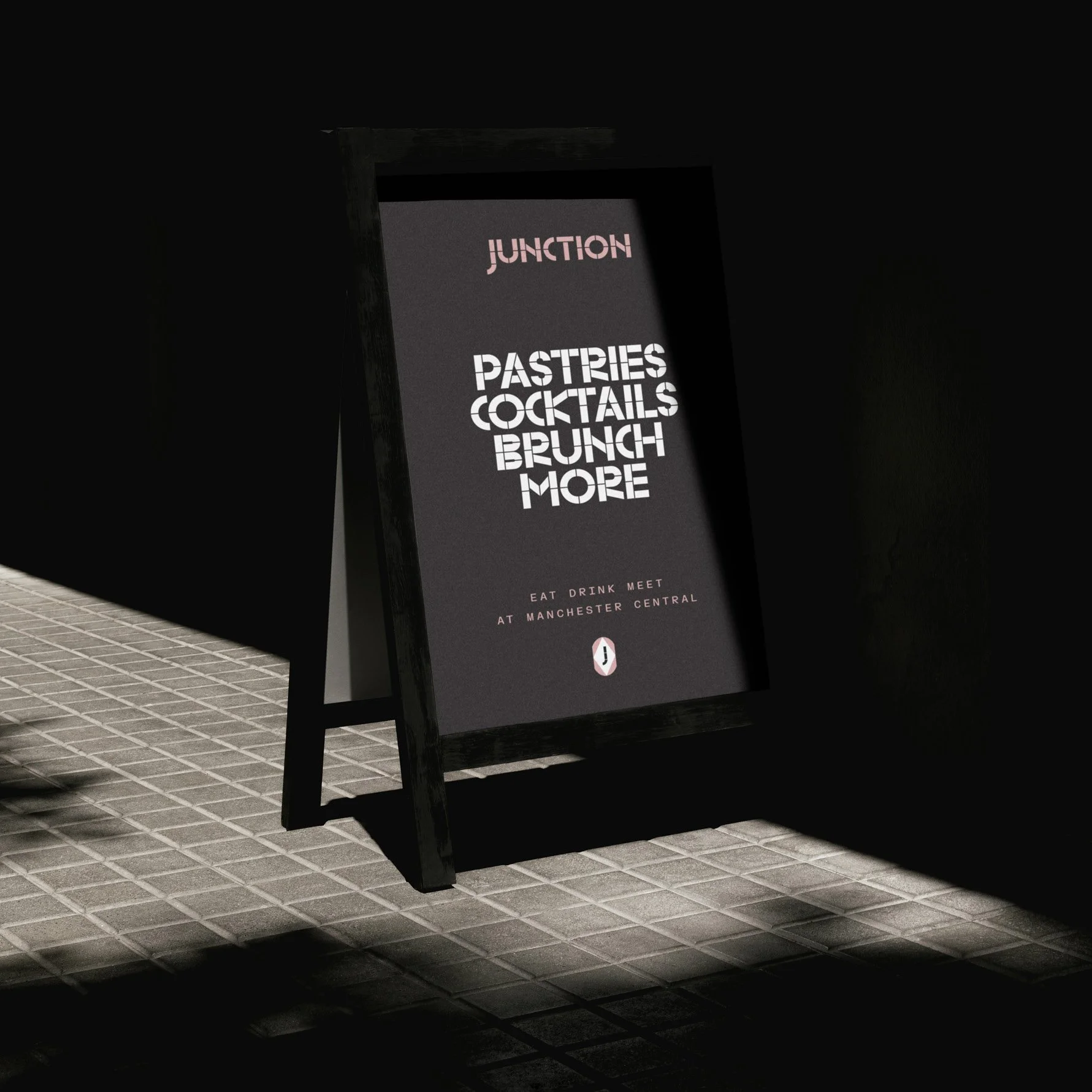
The name and subsequent look and feel, all stemmed from the provenance of the location of the historic former railway station. Looking into the archive, we discovered that the Junction Canal previously ran through the site, coupled with the overarching theme of defining a flexible space where different paths cross and people connect. 

Process
Concept

Two women sitting at a table, using a computer, with a pixelated black-and-white filter and a pink and white X overlay in the center.

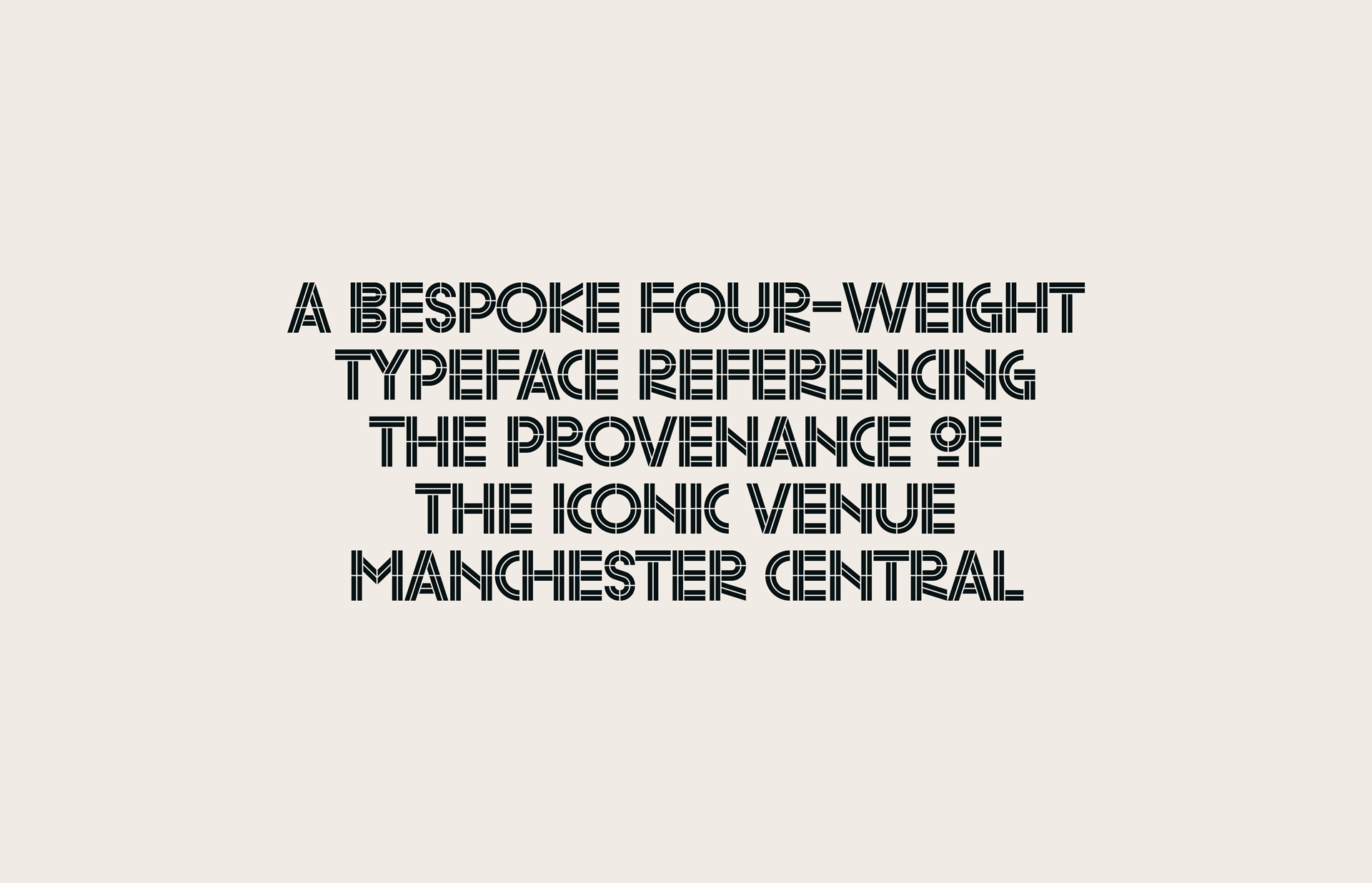
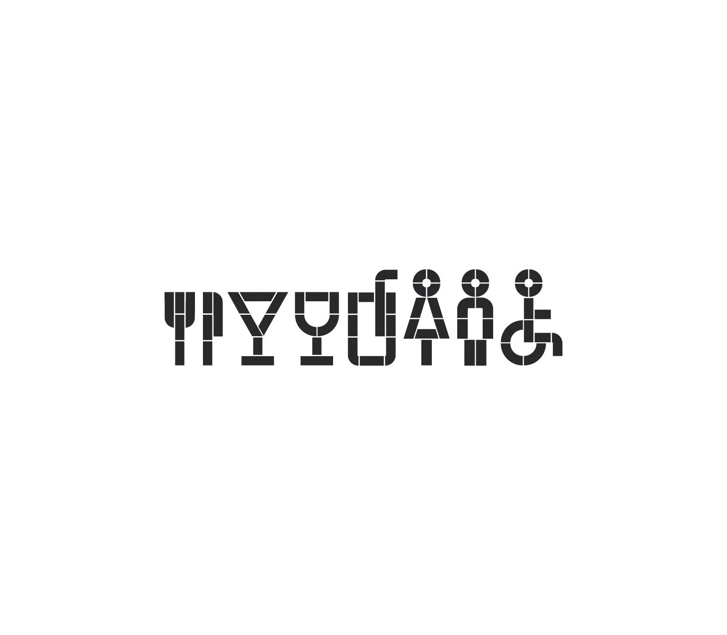
As a key component of the identity, we created a bespoke typeface that drew inspiration from rail tracks and their fluid interconnecting elements.

To add further flexibility in tone of application, multiple weights and variants were created – Regular, Inline, Track and Thin.

Bespoke Typography

Text in a bold, geometric font stating: 'A bespoke four-weight typeface referencing the provenance of the iconic venue Manchester Central.'
Close-up of overlapping train tracks in black and white with a centered color palette graphic.
Junction Café logo on a dark grey background with colorful, stylized text.
Stylized text displaying 'ABC123' in large, futuristic font with a dark gray background.
A cocktail glass filled with a frothy beverage, with the words "Sit Back & Soak Up" overlaid in white geometric font.
Sanitary facilities symbol with accessible stall in black on white background.

Further Case Studies

Workforce Reporting Consortium
Creating a new standard of benchmarking human capital